Notation
Notation is a tactical urbanism intervention centered around promoting community engagement. It asks passersby to interact with the artwork, contributing to their community in a personal and unique way.
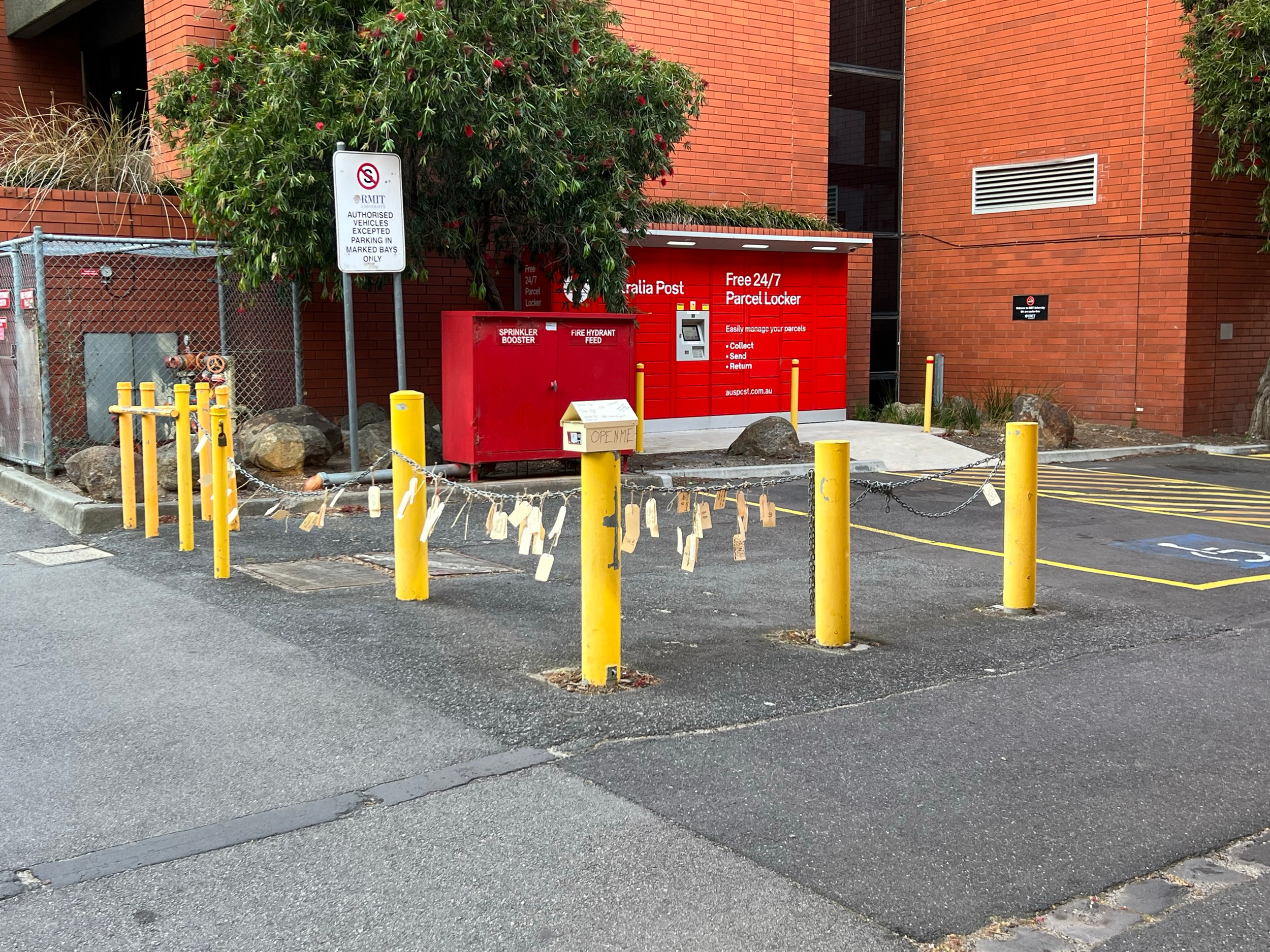
Drawing on traditional trans-cultural “Wishing Trees” and Yoko Ono’s reinterpretation of those traditions, Notation provides all the instructions and materials required to engage with the ever-evolving artwork on site in an intuitive mailbox and with written directions.
Pedestrians are asked to respond to prompts, given on the mailbox, and write those responses on a shipping tag. The shipping tag has a tie attached, and once the response is written/drawn the person is encouraged to hang their tag on the chains that string the bollards together, or on the tree on site.

-
Every Monday I catch a tram to Melbourne Central and navigate through a concrete jungle of bodies, cars and glass until I find my way to my building.
I walk on the left side of the street, and I follow the flow of everyone I walk with. I look up to meet someone’s gaze, but I see only the steady bob of heads facing away from me. On the other side of the street the people walk the other direction, and I turn in hopes of finding a familiar face, a quick smile or another understanding, tired face. I am greeted by steel and glass, glossy clear coat on grey, silver, graphite paint.
Parking bays line the street, girting the guttered edges and parading down the median strip. Filled to the brim with an array of unidentifiable SUV’s, amorphous shapes each vital to transporting a single person to and from work; their use woven so intimately into a daily routine that the intentions of purchasing those vehicles are lost to the purchaser’s own periphery. Gone is the preconception that their seven seats will be aptly utilised, that the large trunk space and high torque figures will be used for camping and off-roading. Instead, the drivers gloat at the trams and the trains passing their traffic-laden vehicles, glad they do not have to suffer the same fate as those taking the public transport. A fate of timely arrivals, a fate of avoiding congestion and frustration, avoiding parking tolls, avoiding costly accidents and maintenance. A fate of empty streets and cleaner air.
Today I see a knitted scarf of sorts, wrapped around a bicycle hoop. Crocheted with purpose, the scarf gives a brief window into the souls that dwell here, the intervention placed over the brash steel hoops forming a soft facade. Heartening though the act is, my notice of such a change in the environment masks an apathy I have grown accustomed to. An indignation I have built for my built environment, to expect such brash steel, to expect the sheen of sunlight reflected against my furrowed brow whilst I submissively keep my eyeline low. My last encounter with art took place in a gallery, secluded from the populus and placed high on a plain white wall; a self-indulgent declaration of importance for those who would seek the artwork out. But here, deep in the inner city, far from the pristine walls and decorative frames, lies a crocheted scarf affixed around a bicycle hoop. What else to call this but art?
I miss the streetscapes I remember from when I was young. I miss looking across the road and seeing people, bustling and busy on their ways to somewhere I will never know. I miss when car’s had purpose, and those purposes were fulfilled. I would look down an alley and see graffiti, an afront to the council that would disallow such heinous crimes as spreading colour and interest. Joy out-washes my detachment when I see a café that has overtaken a parking space with seating, when I see a poster taped to a pole with no intent but to bring humour into a passer-by’s day, when I see a scarf lovingly knitted for a bicycle hoop.
I urge Melbourne to truly consider the necessity of their space. I urge Melbourne to weigh their wonts for personal space against the urban landscapes those personal space machines are razing. I urge you to remember what it was like when whole streets were used for walking, for talking and sitting and greeting, remember the colours and the conflicting architecture of the historic lashing against the modern lashing against the post-modern. I urge the rejection of the claustrophobia, the cramped walkways sidled by slabs of steel, paint and glass, the compulsion for clean lines and smooth paint rendering a walkway as nothing more than its namesake. Use your spaces wisely, decorate your spaces willingly.
Think smaller.
A written statement declaring publicly the intentions, motives, or views of its issuer. Here, a manifesto acts to guide research and design direction over the course of this project.
Tactical Urbanism Intervention
Notation
Notation
The event was a great success. With the short timing given for the intervention, running 10 a.m. until 3 p.m. on Monday the 23rd of October, 2023, we provided only 100 shipping tags. The event ran over-time, with us leaving the location at 6pm. By that time all 100 tags had been used.
Around two thirds of the interactions were by groups of pedestrians, most being three or four people. Groups engaged with the installation far more willingly, influenced by a mix of herd mentality and peer pressure, leading to the installation becoming populated relatively quickly. We found groups tended towards less emotionally heavy responses compared to individuals. Individuals who interacted with the intervention not all fill in tags with many stopping to look and understand the intervention, picking up and looking through other’s responses, before moving on. Individuals who did fill responses were often shy, looking through other answers before moving to the mailbox and carefully reading through the instructions. Once they filled their own tags we saw far more care and emotional engagement with the installation than groups had.
Context Research
Tactical Urbanism, Rewilding Spaces, RMIT PlaceLab
Tactical Urbanism
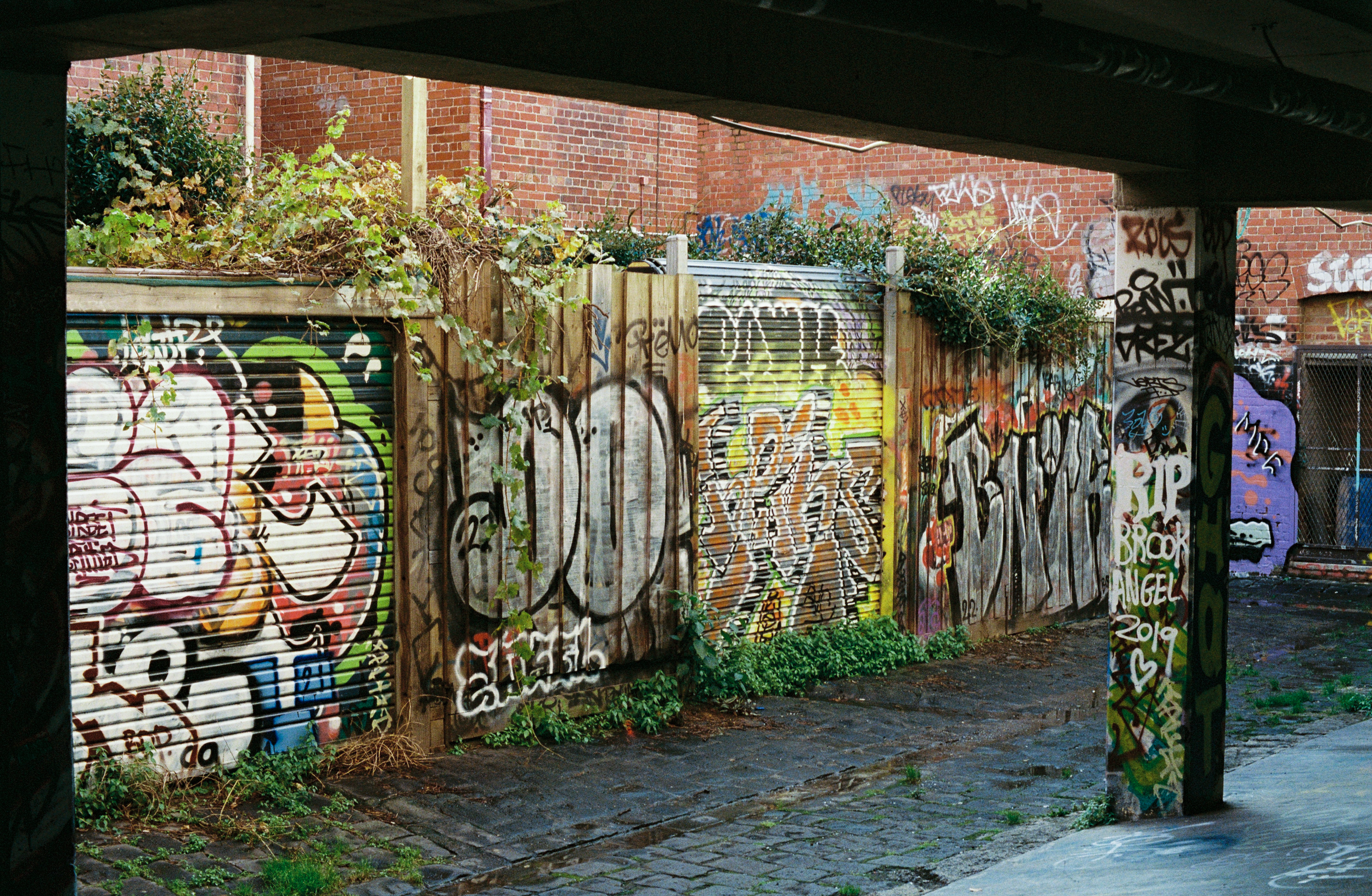
Tactical Urbanism refers to a grassroots approach to urban planning and design that involves temporary, often small-scale interventions and changes to the built environment to improve a neighbourhood or public space. These interventions are usually low-cost, quick to implement, and reversible, and they are intended to address specific local challenges or needs.
The concept of Tactical Urbanism often involves community engagement, where local residents, artists, activists, and other stakeholders collaborate to transform underutilised or neglected spaces into more vibrant, functional, and people-friendly areas.
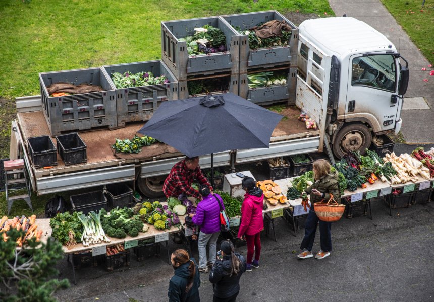
Temporary markets or street fairs can bring local vendors and artisans together, promoting local businesses and creating a sense of community.
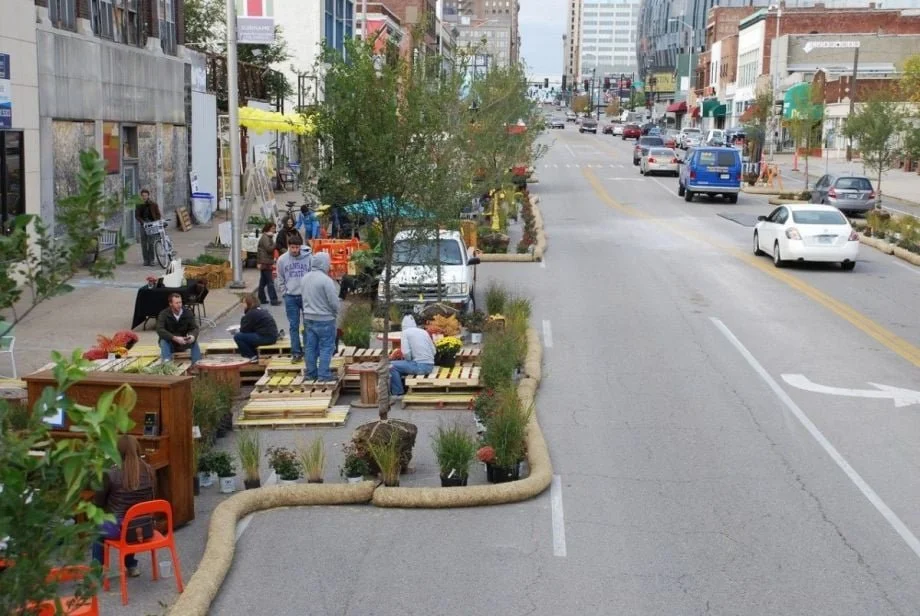
Taking over a parking space or two, parklets are small public spaces built in the area, usually occupied by cars. They often feature seating, plants, and other amenities, transforming a portion of the street into a people-oriented space.

Rewilding Spaces
Rewilding is a progressive approach to conservation.
It's about letting nature take care of itself, enabling natural processes to shape land and sea, repair damaged ecosystems and restore degraded landscapes. Through rewilding, wildlife's natural rhythms create wilder, more biodiverse habitats.
In relation to Tactical Urbanism, rewilding is an approach to the acts and methods of tactical urbanism that encourages the natural “rewilding” of a space, reintroducing connection between individuals, community, the built environment and nature.
Art installations in areas draws more attention from pedestrians and locals. The attention reconnects people with their passing environments, and can bring new and interesting reactions and emotions.
Rewilding aims to reintroduce people and communities to their natural environments, something as simple as sitting on the grass instead of park benches.
RMIT PlaceLab
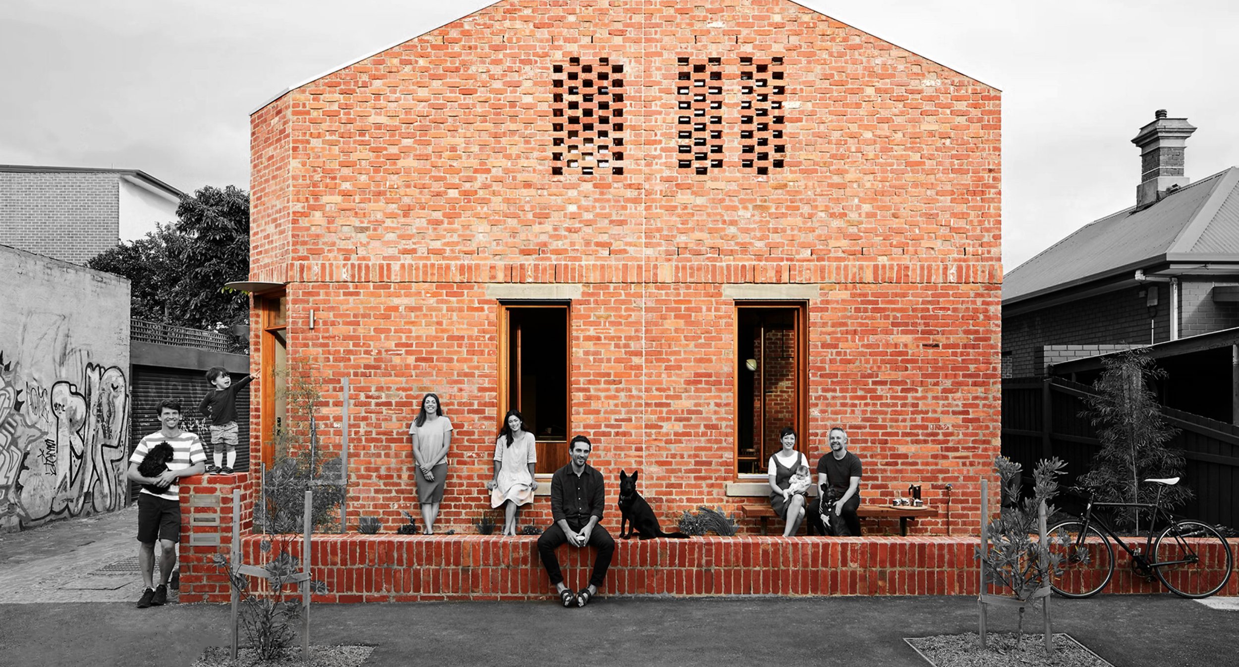
RMIT PlaceLab is a significant initiative developed by RMIT University and strengthened by the generous backing of the Victorian Higher Education State Investment Fund (VHESIF).
RMIT PlaceLab is primarily concerned with the fields of urban and spatial planning, design, and its interconnected areas, since it is driven by a clear sense of purpose.
Beyond the realm of traditional academic endeavors, it functions as a meeting point where the collective creativity of the community harmoniously merges with the essence of scholarly investigation.
Livable
Inclusive
Vibrant
Site Research
Site 1, Corner of Little Cardigan and Queensberry
Physical Attributes
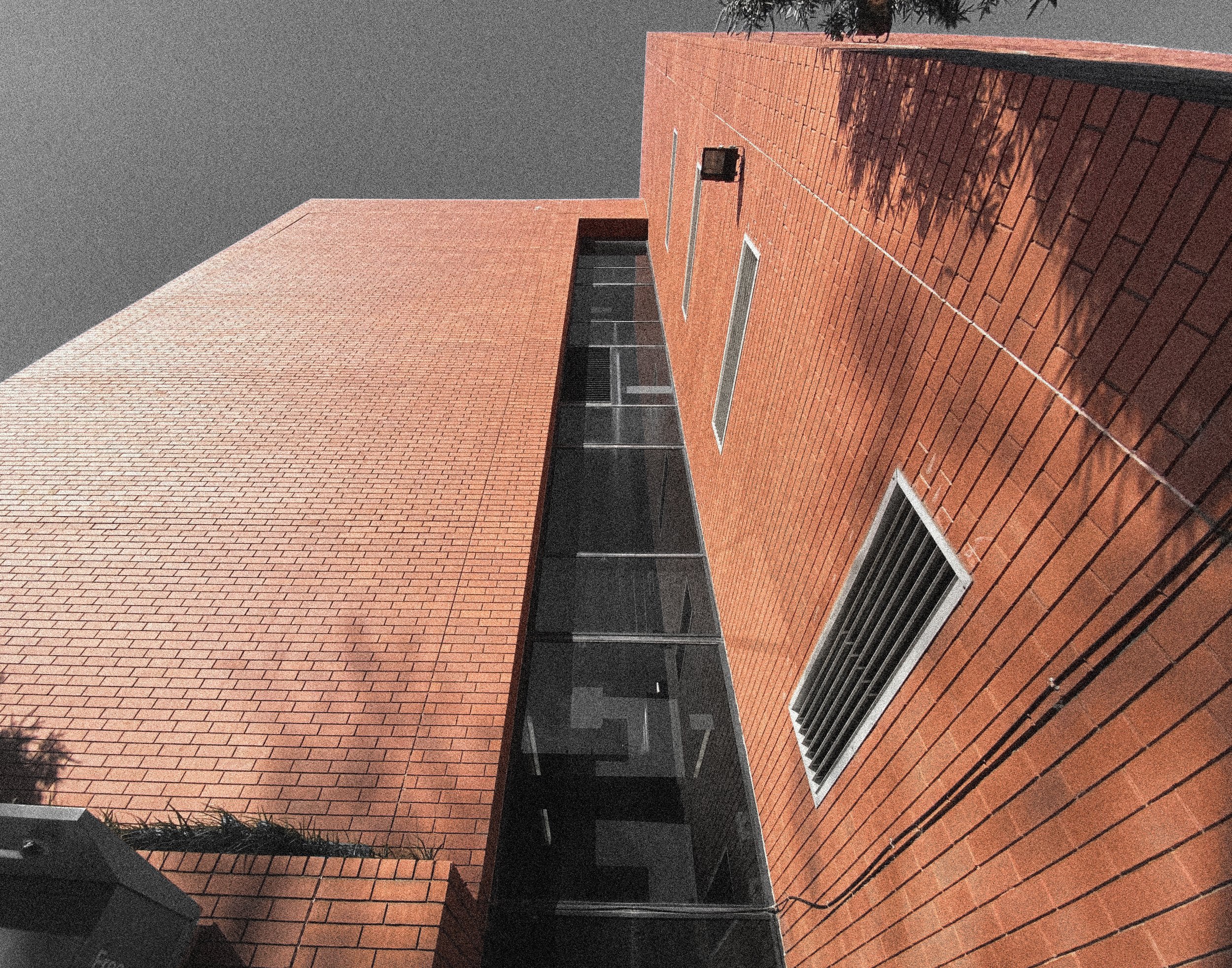
The site measures around five metres squared. The site is placed at the entrance to Little Cardigan Street from the Southern side of Queensberry street. There are multistorey buildings made of red brick on either side of the road entrance, abutting the West side of the road and set back about five metres on the Eastern side. In that five metres lies the usable space for our site.
Behind the fire hydrant is a kerb, and the remaining area is woodchip over soil. There are worn sandstone boulders here, and a eucalyptus willow provides a small amount of shade over the rocks.
Against the wall on the far North-East corner of the site is a chicken wire cage, measuring about two metres square and two metres tall, housing a second fire hydrant.
On the south side of the second disabled parking space is a shipping container in what was once more parking spaces, and pressed between the shipping container and a wall is another eucalyptus willow.
Despite the two small trees, the site is overwhelmingly urban. Asphalt, concrete, brick and steel dominate the landscape and the site-lines don’t deter from these views either.
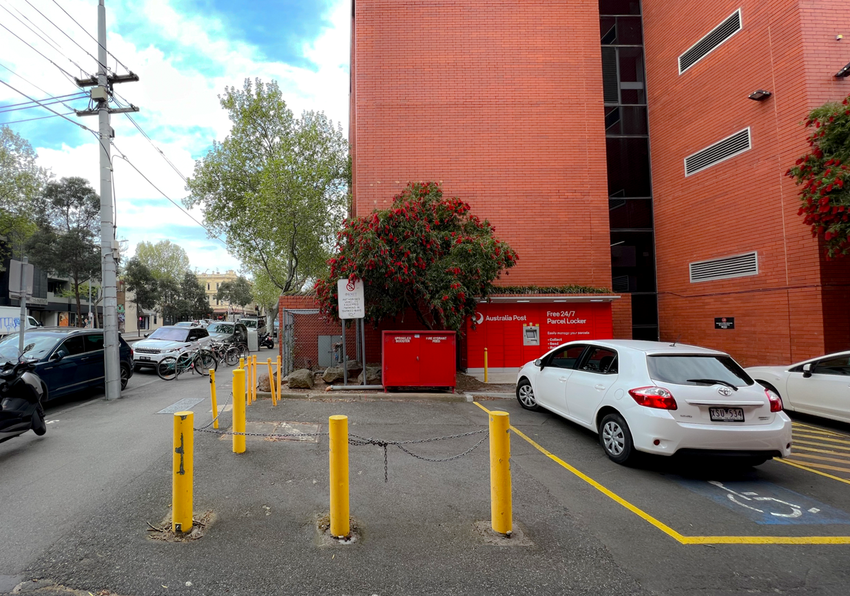
A three metre square patch of asphalt extends parallel to Little Cardigan, blocked off by yellow bollards connected by chains. On the far side of the asphalt square there is a red fire hydrant box, a metre tall and a metre and a half wide. It seems apparent the chained area keeps the space in front of the hydrant clear for use in emergencies.
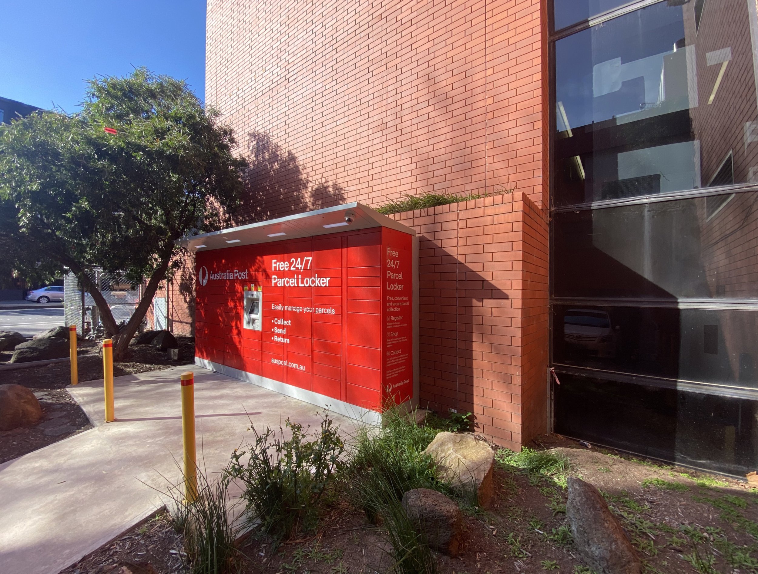
To the south of the chained area is a disabled parking space, followed by a “keep clear” walkway and then another disabled parking space. The walkway leads from the road, between the parking spaces and to an Australia Post parcel locker.
Interactions
The site seldom has visitors, but its proximity to Queensberry street, which has a steady traffic flow throughout the day, lends to pedestrians being very closeby. From our research, we have found that the majority of passer-bys are regulars. Students, office workers, RMIT University staff and faculty, and local residents were common pedestrians. Due to the nature of most persons being workers or students, we found that around open of business and close of business hours had the highest numbers of people passing the site, as well as an upturn of students around when classes begin/finish.
The most common use of the site and its surrounding space occurs at the bicycle hoops adjacent to the site, along Queensberry Road. Smokers congregate here almost hourly, to smoke and chat. After conducting interviews, we determined that most of the smokers are faculty, staff or students of RMIT University, particularly occupants of Building 56, which has an entrance/exit onto Queensberry a few metres away from the bicycle hoops.
The other very common use of the space is access to the Australia Post parcel locker. We found that the parcel locker is accessed around 3-6 times a day during daylight hours.
Emotional Investigation
on Colour and Residency
When occupying the site, there is a certain sense of claustrophobia. Tall walls of brick and glass dominate your line of sight, persisted when you look across the road and are met with an apartment complex of sheer glass reflecting the red brick buildings back at you.
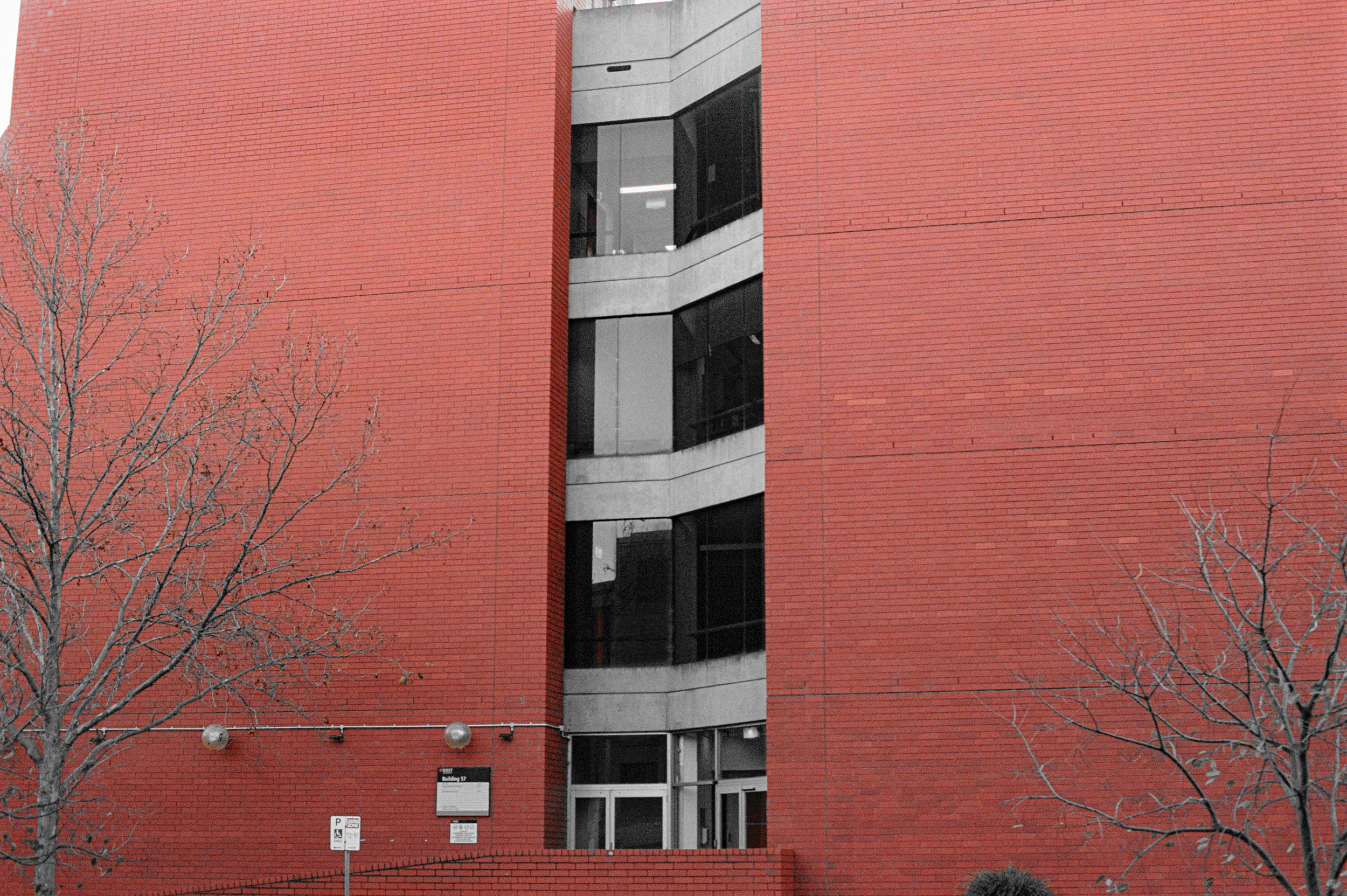
The colour red dominates the site. It is hard to work out why from a cursory glance, almost black asphalt, grey concrete and steel make up a large portion of the site, but these blends of greyscale fall by your periphery. They give way to the red bricks towering three to five stories around you, the red painted fire reel box, and red painted AusPost parcel locker; even the red-toned boulders, a high iron content granting them a rusted patina. The black and white images on this website are formed using only the red channel; the closer to white each pixel is, the closer to pure red that pixel in in reality.
Yellow forms a secondary colour, the bollards sanctioning the site from Little Cardigan Street and the poles protecting the parcel locker from careening parkers. The parking spaces and the no parking zone are dictated by yellow lines painted on the asphalt.
Together, the down-toned red of the bricks, the intense red of the painted boxes and the saturated yellow form a hazardous standard, what feels like a warning sign imprinted across the entire site.
Despite this, the apparent warning symbolism does not make an occupier feel unwelcomed. There is a strange dichotomy in role that the colours play; the combination does not leave the resident feeling unwanted but instead produces a safety net. In a way, the occupation of the site feels like a break from the outside world, the colours serve a warning to any that would dare break the entrancement of the inhabitants’ peace.
on Parking
There is a parking space on Queensberry Street, immediately in front of Site 1, marked 1P meter. The space is filled most hours of most days, and the car filling is almost invariably an SUV, truck or ute. The use of the space for its intended purpose is frustrating. These tall vehicles block the line of sight from the site out toward the street, and it adds to the claustrophobia of the site while not contributing any of the advantages attributed to the other features that create similar feelings. The value proposition, from the perspective of a researcher dedicated to this site and to optimising the usage of spaces, is very low. One car, parked for only one hour, that completely obstructs the view into and out of the site from anywhere more than three metres from the site.
on Occupation and Respite
In the early mornings and late afternoons, the low sun produces a sheen across Queensberry Street and the sidewalk, forcing a squint out of every pedestrian walking towards the sun.
The seering glow of the sun is not accompanied by any much-needed warmth as the concrete jungle of the surrounding CBD creates a wind tunnel that drives its way up or down the street twenty four hours a day.
Site 1, on the other hand, offers respite. Tucked out of the wind, the tall walls and asphalt absorb and emit much of the sun’s missed heat throughout the day. In the late afternoon especially, the site fills with a warm glow and radiates heat towards the occupier, a feature that is much welcomed in the heart of Melbourne’s winter and early spring time.
In the early morning, amongst the bustle of pedestrians on their way to classes, work and public transport, the site is left unscathed and unchecked, the only reactions from passer-bys relating to the site’s indignant occupation by myself and my colleagues. Observed without our intervention, the site remains beyond even the periphery of those pedestrians.
Value Proposition
Context and Sociological Impacts
In our manifesto, we refer to our societal goals of using space with more efficiency and deliberation, as well as reconnecting people with their spaces; to “think smaller.”
Through the number of weeks we spent researching on and around Site 1, we found evidence of not only the disconnection with space we push against in our ethos, but also the underuse of the space.
Notation excels greatly in the ways we intended, which is a great outcome for us. This proposal had two goals, along the guidelines of our ethos, and we feel we have achieved those.
Goal 1: Connection and engagement with space. In just one day, all 100 tags were filled in and hanged, exceeding the level of engagement with the installation that we expected. The answers ranged from meaningless one-word responses to complex and emotional, showing more than the level of emotional and physical engagement that we wanted.
Goal 2: Visual representation of community, and beautification of space. We aimed for the intervention to act as a visual indication of the scale of community, showing other passersby how many people there are in their local community. The intervention also acts as a beautification of the space, a subjective measure that we think we have achieved.


